
Light and Dark Mode Revisited
I wanted to revisit the light and dark update as the original described some changes but didn’t display how these changes impacted the experience on the site. Now that images are working a bit better I figured I would show exactly what’s happening on the site in its current state.
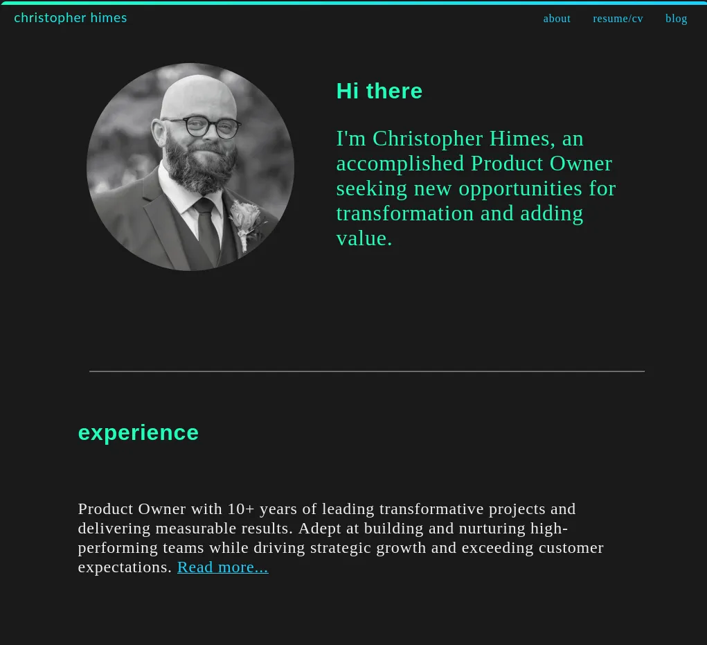
The dark mode which is the primary way I view the site uses an almost black background with bright green and blue for the headers and links respectively.
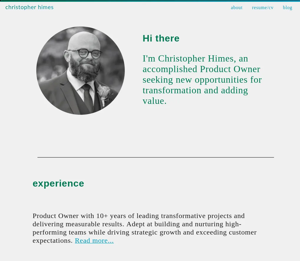
The light mode which I imagine will be the way most people view the site uses an almost white background with medium green and blue for the headers and links respectively.
Additionally, I’ve simplified the setup for light and dark based on a recent blog by James G that was a follow up to his original post that inspired this setup in the first place. Previously the CSS suffered from the same redundancy he discussed in his blog post where every time a color was used it checked light-dark. Now this is baked into the :root variables like so:
:root {
    color-scheme: light dark;
    --background-color: light-dark(rgb(240,240,240), rgb(26, 26, 26));
    --foreground-color: light-dark(rgb(0, 119, 83), rgb(32, 255, 188));
    --link-color: light-dark(rgb(1, 151, 189), rgb(25, 209, 255));
    --text-color: light-dark(rgb(26, 26, 26), rgb(240,240,240));
    --line-color: rgba(211, 211, 211, 30%);
}
This allows h1 to be styled like so:
h1 {
    color: var(--foreground-color);
}
One last thing is the use of gradients which also change in response to the light or dark settings from the user. One example is the site-tile which is just how my name at the top left on desktop or the top center on mobile is classed. The variables plug in just the same here but the added simplicity really helps the more complex -webkit-gradient lines legibility.
.site-title {
    font-family: 'lato-normal', Arial, Helvetica, sans-serif;
    font-size: 1.2em;
    background: -webkit-gradient(linear, left top, right bottom, from(var(--foreground-color)), to(var(--link-color)));
    -webkit-background-clip: text;
    background-clip: text;
    -webkit-text-fill-color: transparent;
    text-decoration: none;
}
These screenshots were taken by me on 4/11/25.
This is day 5 of 100 Days To Offload.
Comments
This blog uses a Mastodon and webmentions for comments. You can comment by replying on Mastodon/ActivityPub/Fediverse account or webmention.